Art Lessons in Richmond & Surrey are Applelicious

Posted February 16, 2015 by tianakaczor
Categories: Visual Art

Tags: , , , , , , ,
This apple is painted quite fast with a wet on wet technique that will allow the different shades and tints and colours to blend into each other.

This apple is painted quite fast with a wet on wet technique that will allow the different shades and tints and colours to blend into each other.

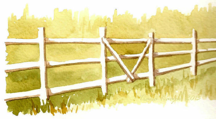
More adult watercolour classes have been added to my schedule at the Thompson Community Centre in Richmond. If you are looking for some beginner instruction in the tricky medium of watercolour come join our class this spring. Each session we will try different projects such as learning to do washes using simple subjects such as fruit and misty mountain ranges, playing with negative space between fence posts, and scratching out highlights on sparkling seas and snow.

There are 3 new sessions at the Thompson Community Centre. Phone 604-238-8422 for info and to register. We meet on Mondays from 1:00 to 2:30. The next session is March 2 – 23. Then the other two are April 13 – May 11 and May 25 – June 22. Hope to see you there!

This green apple is in oil pastel, which is a little tricky to blend. Start with light strokes in a variety of colours and build up the layers.

This green apple is in oil pastel, which is a little tricky to blend. Start with light strokes in a variety of colours and build up the layers.

Here are some examples of the various apple studies I have taught in my watercolur, pastel, and pencil crayon classes for adults and children. I find that the apple lends itself well as a subject for beginners; it’s more interesting than just a circle and yet not so complex as to scare people away. The variety of colours found on apples are another plus as I always stress that a collection of colours is more interesting to the eye than a flat 1 colour subject (although that has its place too, such as in many poster designs and logos).

Soft, or chalk pastel was used on this apple and is much easier to blend than oil pastel.

Soft, or chalk pastel was used on this apple and is much easier to blend than oil pastel.

Whether it is watercolour, pastel, or pencil crayon, build up a layer of different colours, focusing on your main one, like red, but highlighting with ones such as yellows, and darkening with colours such as blues and purples. Start light, and work up the layers until you just do the dark areas at the end. Have fun, and experiment. Paint and draw apples over and over again, as using the same subject will let you see your progress over time.

This apple had each layer of watercolour dry before the next layer or colour was painted on top and thus you can see some of the brush strokes and it doesn't blend like the wet on wet apple shown above.

This apple had each layer of watercolour dry before the next layer or colour was painted on top and thus you can see some of the brush strokes and it doesn’t blend like the wet on wet apple shown above.

A study in value where you only use one pencil crayon. Can also be done with regular pencil. Try a 3 or 4B.

A study in value where you only use one pencil crayon. Can also be done with regular pencil. Try a 3 or 4B.

12 Days of Christmas Art Challenge and Sale

Posted November 16, 2014 by tianakaczor
Categories: Visual Art

Tags: , , , , , , , ,

My 12 Days of Christmas Art Challenge and Sale is on NOW! Inspired by the recent Black and White Photo Challenge on Facebook, I have set a goal to produce small affordable art pieces over the last half of November, hopefully one new painting or drawing every 2 days.

Orpheum Neon sign watercolour and ink miniature by Tiana

Orpheum Neon watercolour and ink miniature by Tiana Kaczor

Orpheum Neon is the first art piece. It is a watercolour and ink drawing of Vancouver’s Orpheum theatre sign. It is based on a photo I took a couple years ago while walking along Granville St.

Get your hands on some new original artworks for the price of a dinner out, and treat your friends, family, or yourself to a one of a kind gift!  All art will be available for sale in my Etsy store. Head over and take a look. Check back every couple of days for new additions.

https://www.etsy.com/ca/listing/211430398/original-watercolour-and-ink-drawing?ref=shop_home_active_1

Steveston Grand Prix of Art 2014

Posted September 23, 2014 by tianakaczor
Categories: Visual Art

Tags: , , , , , , , , , ,

Plein Air competitions are not always easy for an artist who normally creates in the studio where they have lighting and climate control, and are (usually) uninterrupted. This was my second attempt at an outdoor painting competition, and again I learned a lot about composition, material choices, and speed.

Tiana at Steveston's Grand Prix of Art. Photo by Lisa Ernst.

Tiana at Steveston’s Grand Prix of Art. Photo by Lisa Ernst.

The Steveston Grand Prix of Art was held on Saturday September 20. Over 100 artists in 3 categories (adult, youth, and photographers) took part. At 10am we signed in and drew a slip of paper out of the prize cup to find out which location we’d be painting at. I had one of the volunteer drivers take me to my spot behind Prickly Pear garden centre. I had 25 minutes to set up and decide what I’d paint. It wasn’t easy. Trees behind me, a busy apartment block to the left and a road and river in front. I eventually chose the street scene with the whale watching business even though the sun was behind it and everything was in silhouette.

When the 11:00 whistle blew I decided to just start drawing with my Staedtler Mars professional pens. This was a great material choice. The ink drawing was very dramatic and people commented that they loved it. However not planning out the composition first in light pencil created problems later when I got too close to the bottom of the page, and when I had to put the mat on at the end of the competition I ended up covering up the top of my telephone pole and some trees along the river. Yes, words were said that I shall not repeat here.

Halfway through the competition I moved from the ink drawing to watercolour. I kept telling people that it’s easy, like a colouring book, just filling in my drawn areas. Ha! The backlighting on my subjects made the real life objects hard to see so that it was difficult for me to choose paint colours. Well, just wing it! I kept telling myself to go darker faster, but it still ended up being too light in the sky and some parts of the building. I didn’t have the time to layer the watercolours like I do in my studio when I take 8 to 10 hours for a painting.

Having to pause to wait for a car to pass so I could see my subjects on the other side of the road, or waiting for people to move, added to the trickiness of painting outside in public. Yet it was the many positive comments from people that spurred me on when I was doubting myself. Yes, I did hear you as you stood behind me and whispered to your friend “this one is great!”  Thank you. And a young boy’s “Wow!” was wonderful encouragement.

At 2:00 the whistle blew again and I had to put my paint brush down and grab my frame. Then it was a mad dash in my parent’s car back to the Britannia Heritage Shipyards to hand in my art for judging. A late lunch of delicious barbeque chicken from Bean and Beyond Cafe finally helped me relax back to normal speed.

This year I was also very happy that 3 of my youth students entered the competition. I’m very proud of what they accomplished.

You can view (and buy!) everyone’s art in the Seine Net Loft of Britannia Heritage Shipyards, 5180 Westwater Drive, Richmond, BC. until Sunday September 28 from 10am to 5pm each day. Closing ceremonies where they will award the Peoples Choice Award and the Photography Award are on Sunday at 3:00. Thanks to Phoenix Art Workshop for hosting yet another great painting challenge.

By All Means Create

Posted August 14, 2014 by tianakaczor
Categories: Fine Arts

Tags: , , , , , , , , ,

We’ve all had it, that voice that says we can’t do something, or that we can’t do it well enough, or we don’t have the time. Perhaps we need to listen to Van Gogh who said “If you hear a voice within you say ‘you cannot paint,’ then by all means paint, and that voice will be silenced.” The staff at Opus Art Supplies has made a video illustrating this quote. It was a nice little reminder for me this morning and thus I wanted to share it.

Nick Bantock’s “The Trickster’s Hat”

Posted May 20, 2014 by tianakaczor
Categories: Fine Arts

Tags: , , , , , , , , ,
The Tricksters Hat by Nick Bantock

The Tricksters Hat by Nick Bantock

“The Trickster’s Hat, A Mischievous Apprenticeship in Creativity” by Nick Bantock, was given to me recently as a birthday present. In the early nineties I was all excited about Bantock’s first huge success “Griffin and Sabine” which reflected my own love of collage, letters, found objects, and small art such as postage stamps. Then I “grew up” and life got in the way of creativity and play. I’ve become more concerned about a regular paycheque and paying the bills than I am about playing with my art materials. Where did I loose my path? I still create, but something is missing.

Even just having this book put into my hands has suddenly sparked my brain into creative drive. Like Julia Cameron’s best selling “The Artist’s Way”, which got me out of a creative and personal bump in my road a few years back, I hope “The Trickster’s Hat” will guide me down an artistic highway for some fun adventures.

<p><a href=”http://vimeo.com/39181285″>Nick Bantock, Author & Artist</a> from <a href=”http://vimeo.com/user1686564″>Jenn Strom</a> on <a href=”https://vimeo.com”>Vimeo</a&gt;.</p>


Make Good Art speech by Neil Gaiman

Posted December 31, 2013 by tianakaczor
Categories: Fine Arts

Tags: , , , , , , , , , , , , ,

With my recent feelings of being a bit blocked, this was an amazing speech to listen to at the end of one year and the beginning of a new one. No, I’m not blocked, I’ve just been caught up in paying bills, and completing chores, and trying to do things that everyone else says I should do. Life isn’t always easy, but at the end of the day, or perhaps the beginning, we should do at least one thing – make good art! Thank you Neil Gaiman for your good words.


Tiana’s Etsy Store is Now Open

Posted November 30, 2013 by tianakaczor
Categories: Fine Arts, Visual Art

Tags: , , , , , , , , ,

Now you can buy original and printed art by me on my Etsy store Tiana Kaczor Fine Arts. There’s still time before Christmas to pick up a hand printed photograph or a miniature watercolour. Or if you live near Vancouver, B.C. (so we don’t have to rely on mailing times) there’s even time to commission a watercolour or drawing based on a photo of your choice.
Visit my store here:  

I’m still learning about the wonderful word of Etsy, researching how other artists and craftspeople list their wares, so it’s been a little slow for getting some of my art up for sale, but you will find a few items there now.
I’m listing a variety of mediums and styles in hopes of getting some feedback from window shoppers and buyers about what they’re interested in getting.  Prices range from around $10 to $400.
I will be uploading more artworks for sale in the next few weeks, so keep checking back for new stock. Original watercolour postcards and vintage computer art prints are next on my list for stocking my shelves.

Tiana Kaczor Fine Arts Etsy banner

Come take a look at my Etsy store

Tiana’s Warrior donated to Richmond Public Library

Posted November 19, 2013 by tianakaczor
Categories: Fine Arts, Visual Art

Tags: , , , , , , , , , , ,

My painted warrior has been donated to the Richmond Public Library by the Williams and Lomness Families in memory of their parents Yvette and Walter Beswick. An unveiling and tea was held early November at the Brighouse (Main) Branch and the rain did not deter us from going outside and seeing “Wu Chang” back in the same spot he was 2 summers ago.

Tiana Kaczor's painted warrior gets donated to the Richmond Library

The Williams and Lomness Families at Warrior unveiling at the Brighouse branch of the Richmond Public Library


My warrior was bought by the BC Lions Society at their auction in September 2012 in hopes that they would find a donor who would place it in a public space in Richmond. Stephen Miller connected with the Williams and Lomness Families who wanted to do something to remember their parents. During the tea, daughters Julie Williams and Susan Lomness spoke about how their parents, Yvette and Walter, loved coming to the library, and the family all contributed to make this donation happen.

Donation was made in memeory of Yvette and Walter Beswick

Donation was made in memeory of Yvette and Walter Beswick

I’d like to thank the families for their generous donation. I am happy that my artwork is in a public place where it will be enjoyed by many people for many years. It is a library that I use often, so I will get to see my warrior regularly. (Many times artists make art and it is sold and you never see it again.) The staff of the Richmond Public Library are all excited about this unique addition to their institution, and I know they will take care of my “Mr. Wu”.

Risk The Highest Step in the World

Posted October 17, 2013 by tianakaczor
Categories: Fine Arts

Tags: , , , , , , , , , ,

Ghost River Theatre’s David van Belle and Eric Rose have created a production that asks “What happens when you take a risk? What makes you take that first step from an unimaginable height? ”  “The Highest Step in the World” is a one man show (David van Belle, who does a great job) with 2 men behind the scenes who make him fly. Based on Joseph Kittinger’s record breaking jump from a weather balloon in 1960, the play also includes the story of Vesna Vulovic, an airline stewardess who survived a fall out of a bombed plane, and the mythological characters of Daedalus and Icarus.

Sometimes people take risks and fail. On my way to the theatre I was driving around a tight curve to get onto the Queensborough Bridge. Traffic slowed and I eventually had to pass a semi-trailer truck lying on its side on top of the cement road dividers.  The driver had obviously taken the curve at too high a speed and tipped over. Some of its wheels were still spinning. Emergency vehicles hadn’t arrived yet. When I returned across the bridge in the late afternoon after my theatre experience, I saw the truck being hauled away, the cab horribly crushed. I don’t know whether the driver survived. We take risks in our vehicles every day, and often don’t think about it.

Then there are the risks we do think about, like jumping out of a tree when we’re little, or creating a new piece of art. It can be as small as deciding to use a different colour palette when redesigning your living room, or as large as taking the steps to walk on the moon. Taking risks can be scary, but without it life can be boring. Without risks we would never have new inventions, or art pieces. We might never get married, or travel to a different country. I’ve always been a cautious person, but I do take some risks, and maybe it’s time to take a few more.

For you, why not take a risk in theatre and go see “The Highest Step in the World” on now until October 26, 2013, in Richmond’s Gateway Theatre. Here’s the trailer:


Beginners Watercolour Lesson – Value Sketch and Negative Space

Posted September 27, 2013 by tianakaczor
Categories: Visual Art

Tags: , , , , , , ,

Over the last couple of years I have been fine tuning my beginners watercolour classes for adults and children. I usually start off with the same lessons for all ages, just moving a little faster, and into more detail with the adults. After teaching the colour wheel and basic brush techniques there are several lessons I run through. I have found that my own watercolour skills are always improved every time I demonstrate these lessons, and therefore recommend beginners and seasoned watercolourists to run through these simple “warm ups” every once in awhile.

Maple seed value study in gray watercolour.

Maple seed value study in gray watercolour.

The Value Sketch teaches us to look at the values in real objects and paint from life instead of a photo. I bring to class some simple found objects like leaves or maple seeds. Sometimes I have the students use only one colour, like gray, and then all they worry about is the intensity of the colour and watering it down for the light areas. Other times I have students try to mix the actual colours on the found object. We mix puddles of the colours in our tray, and leave room to add water for lighter values. Once the colours are ready then we can start the painting.

Value color sketch of maple seeds and feather

Value color sketch of maple seeds and feather

We start with a light pencil sketch. For young children I may allow them to trace the object so they don’t get frustrated with the drawing. Then we apply 3 or 4 layers of paint, working from the lightest areas of the object to the darkest. These are small paintings, so very little paint should be on the brush. We don’t want the colours to run. Then wait a couple minutes for the wash to dry before painting the next layer of detail. The last layer is the darkest areas and then the shadow under the object is added to make it look like the leaf or seed is sitting on a table.

The Value Sketch is a quick lesson so I usually do a second lesson in the last half of the class. Since you rarely use white paint in watercolours, but instead leave the white paper free of paint, it’s good to have an exercise that helps students be more aware of the paper and leaving areas blank. Negative space drawings can be taught if time permits, or you can go directly into an exercise of painting a white fence.

Fence Negative Space Watercolour

Fence Negative Space Watercolour

We start by lightly drawing the posts and rails using only one line each in the middle. It’s nice to give a little perspective as the fence goes away from you and perhaps add a gate. Next we mix our paint colour puddles, which are the colours of the background of grass or bushes. When we’re ready we can start by prepping the paper with plain water in each negative space area, or we can just jump in and start painting. Try to load enough paint on the brush so that you can finish a whole rectangular space between the posts and rails. Be careful not to get too close to your pencil lines as then you’ll have a very skinny fence! When one negative space is done then load up your brush again and paint the next one. Dip in different colours to add more interest to your background. Be careful not to have each negative space a different colour as that wouldn’t look natural, but instead dip into a second colour halfway through painting one area and work fast so the colours blend on the paper. When dry you could add some detail of grass blades in front of your fence. Then make your white fence 3 dimensional by choosing a direction for the sunlight and painting shadows on one side of each rail and post. When the painting is totally dry lightly erase your pencil lines.

If you have any questions about these exercises please write to me in the comment section.  Some books I consulted while planning my lessons this past summer were: “Watercolour For Starters” by Paul Talbot-Greaves, and “Watercolour Challenge, Techniques in Practice” Channel 4 Books.